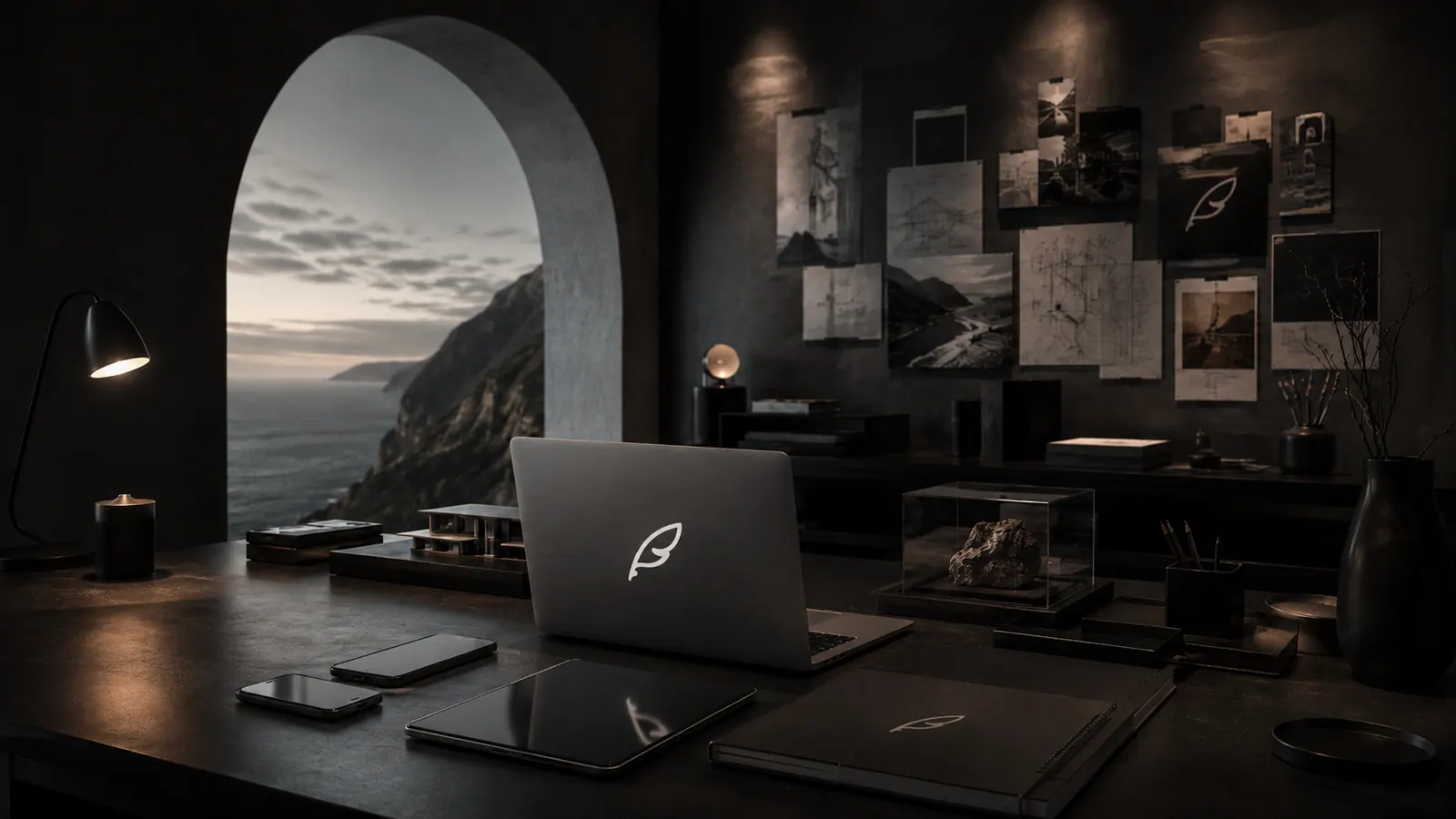
Almost all software now looks the same: a flat white card, a blue button, a sans-serif label, a shadow set to twelve per cent. It is competent and it is anonymous. We decided very early that Serogi would not look like that, and the decision has cost us real time on every screen we have ever built.
The prevailing design languages were written for enormous organisations shipping enormous surfaces, where the priority is that a thousand engineers can produce a consistent result without talking to each other. They are systems for avoiding mistakes. They are very good at that, and the price is that nothing made with them has a hand in it. When every product uses the same components, taste stops being expressible.
Paper, not glass
The page you are reading is not flat. It carries a fine grain — several layers of it, at different frequencies, with sparse flecks of black, green and deep red seeded so the tiles never repeat in lockstep. You are not meant to notice it. You are meant to notice that the surface has a texture, the way paper does, and that light lands on it rather than passing through it.
This is the single most technically awkward decision in the product. The grain is a fixed composited layer beneath the entire document, which means nothing opaque may sit on the body element, which means every page wrapper has to be transparent and every surface above it has to be built with that in mind. We keep it because it is the difference between a screen and a material.
Dark first, and light that means it
Dark is the default, and it is properly dark — near-black rather than the dark grey most products settle for. Light mode is pure white with deep navy ink, not the fashionable off-cream that reads as beige on a bad panel. Both are complete designs rather than one design with the colours flipped, and the accent is a muted antique gold that appears sparingly enough to still register when it does.
In Serogi Alpha the same thinking runs further: five complete themes, each with its own palette, resolved through one central source so that a colour is defined once and every screen follows. There is no screen in the app allowed to invent its own idea of what dark means.
Type with a voice
Display headings are set in a high-contrast serif at light weights and generous size, with real letter-spacing decisions rather than defaults. Body copy is a clean grotesque at comfortable measure. The combination is closer to a printed monograph than to a dashboard, and it is deliberate: it signals that the words were written rather than generated, which on a site largely about language is the whole argument.
Restraint is expensive. Anyone can add. Knowing what to leave out is the part that takes years.
Motion that respects the reader
Everything moves on the same easing curve, and everything moves slightly less than you expect. The hero images on these pages drift horizontally as you scroll, at a fraction of scroll speed, so the page has depth without asking for attention. If your system asks for reduced motion, all of it stops. Motion is a way of describing space, not a way of proving the site is modern.
None of this is decoration bolted on at the end. It is the argument. A company claiming to build careful instruments should be visibly capable of care, and the interface is the first evidence anyone ever sees.